Update: Someone (link in Chinese) told me that the reason might be the font smoothing feature. After turning it off in System Preferences > General > Use font smoothing when available, the screen becomes crispy clear. (I also adjust the scaling to 200%, i.e., 1280 by 800 logical resolution, to ensure best rendering result.) I never touched that setting in the first place, nor did I know its existence. I have no idea why Apple would turn it on for its Retina display and why the adjustment looks so desperate. Any why not ‘use font smoothing for low scaling ratio’? I just checked my Surface Book 2, which has ClearType on, by default. Turning off ClearType yields suboptimal rendering. ClearType is adjustable and the out-of-box experience is great. Perhaps Apple spent its time on adjusting the color, not the font smoothing parameters.
Having received (link in Chinese) my MacBook Pro 13-inch, I started to alternate between my Surface Book and MacBook, to get used to macOS and keep everything synchronised. Today when I was transcribing my notes to OneNote, I noticed a rendering problem on the screen. Propaganda (from Apple fanboys) has it that macOS supports high DPI displays well (of course including its very own screen), it turns out the story isn’t as true as the propaganda claims.
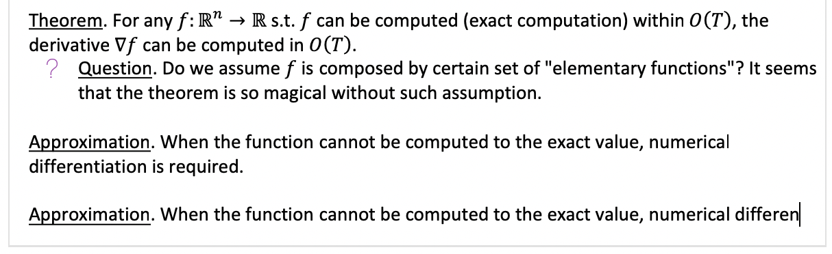
When I was transcribing my notes, I noticed that the width of the letter ‘l’ in ‘numerical’ altered as I typed. See the screenshot below.
This is very strange because: 1) it is said that macOS supports high DPI displays very well; 2) I am using the default settings; 3) OneNote 2016 on Windows doesn’t suffer from this issue (not on Surface Book 2 15-inch). To confirm who is to blame (either Microsoft OneNote or Apple macOS), I decide to try it out with TextEdit app that comes with macOS.
The native physical resolution of MacBook Pro 13-inch is 2560 by 1600. The default scale has a logical resolution at 1440 by 900, and the 200% scale has a logical resolution at 1280 by 800. In TextEdit, I chose font size 27. The table below demonstrates that the logical and physical pixel sizes are always integral.
| 27 pt | 27 px | |
|---|---|---|
| logical | 36 | 27 |
| default physical | 64 | 48 |
| 200% physical | 72 | 54 |
The rendering result is defective, as can be seen from the screenshots below.
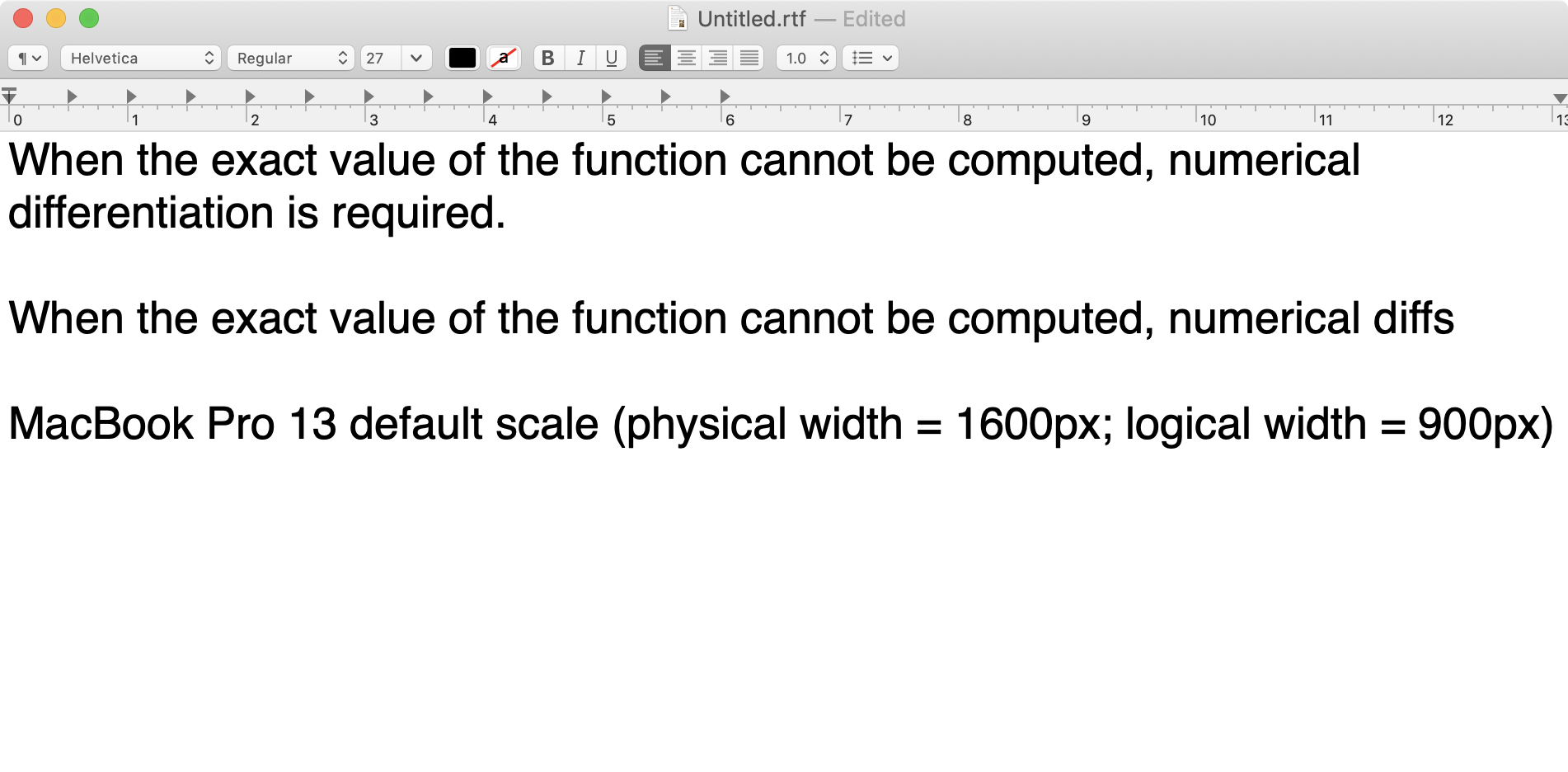
In the two figures, the formatting of texts and texts up to ‘numerical’ are identical in each case. The texts are left-aligned so there isn’t a problem of space size adjustment. However, in both figures, the first line is thicker than the second, and this is very noticeable on screen. It seems to me that some anti-alias techniques are (unnecessarily) applied to the high DPI display, giving a less crisp result. (If you look carefully, there is gradient at the boundary of the glyphs, which is typical when the renderer super-samples and scales down the result with smooth interpolation.)
A friend of mine told (link in Chinese) me that MacBook Pro 13-inch internal display super-samples the signal by 1.125x, which means the ‘real native’ resolution is 2880 by 1800. I am not sure whether this is true. But even if it is, the ‘real physical’ pixel size of the font size in default scale must still be integral, and that doesn’t explain the defective rendering result.
There is a Chinese nursery fable 《小马过河》 (Pony Crossing the River). It basically says ‘you never know until you try’.
Yeah, I never knew until I try.
Please enable JavaScript to view the comments powered by Disqus.