Updated Check my Windows Standard simulation theme Standard Again here.
I am not visually impaired or colour blind or any kind of that. I do have short eyesight, though, and I wear lenses. However, as you can see from my previous blog entries, I am quite dedicated to making my site as accessible as possible. I am determined for two reasons. The first is that I heard a lot of legends about visually impaired programmers. Often they have to work with High Contrast themes or use a screen reader, but are still capable of doing his work and doing it brilliantly. The second is that I did know such a programmer, or an algorithm teacher to be precise. His name is ZHU Ruoyu. He could barely see anything on the screen except that there is a screen. When he wrote code or explain algorithms to me in secondary school, he has always used 北极光 (Aurora Borealis), a screen reader. (Well I did wonder why he did not use Narrator instead.) He was encouraging and kind. By the way, this blog site works great under High Contrast themes.
Another thing is that, as a daily user of Windows, I find that the default cursor size is awful for high DPI screens. I exclusively use extra large cursor schemes now on my Surface Pro 3.
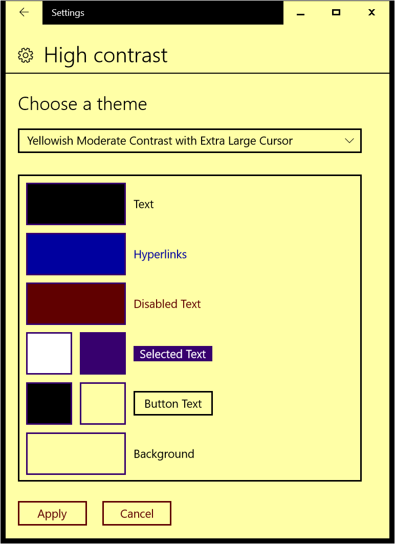
So I made my own themes. One is a usual theme with custom wallpapers and extra large cursor scheme. The other is High Contrast Black with extra large cursor. Once when I tested my code under High Contrast Black, a friend of mine told me that the theme looked scaring (overly contrasty) to him and he said if it was him, he would use a black-on-light-yellow theme instead of a white-on-black one. Later it struck me that I could use a High Contrast theme as my daily theme. Combining the suggestion of my friend, I made a Yellowish Moderate Contrast with Extra Large Cursor theme. It is based on High Contrast White and several background colours have been modified to ffffa6.
I decided to share the themes. The copyright is reserved but any personal use, including downloading, applying, redistributing with the original files, redistributing with the link to this page, and editing without republishing, is allowed without written permission.
The yellow theme has the following scheme:
Updated on 14 April 2018
I came across this article when I searched something about programmatically taking screenshots of certain windows. Following the steps, I created a theme Standard Again that resembles Windows Standard theme found in Windows 2000. There are two tricks involved:
- Interpolate the title bar background since Windows 10 does not support gradient title bar.
- Set
Windowto some grey color to prevent pale background.
Note that sometimes Windows 10 fails to invalidate tile cache for High Contrast themes. In that case, go to Settings > Personalisation > Start, toggle Use start full screen twice. It could be more sound to first exit High Contrast theme, then apply a system-defined scheme that is similar (e.g., High Contrast White), and finally apply the desired theme.
Please enable JavaScript to view the comments powered by Disqus.